From a raw idea to a brand people collect, stick, and relate to

Once the brand language was locked, Sticker N Streets finally came alive.We worked on shaping sticker collections with clear stories. On Instagram content that didn’t feel like marketing. On captions, hooks, and CTAs that sounded human, not forced. 

What We Started With

Sticker N Streets didn’t come to us with a perfectly written brief. It came with a feeling. A simple thought that kept coming back.
What if stickers weren’t just decorative, but expressive?
Our role wasn’t to jump into design. It was to sit with the chaos and make sense of it. To listen carefully and decode what this brand was really trying to say.

How We Started

Sticker N Streets didn’t come to us with a perfectly written brief. It came with a feeling. A simple thought that kept coming back.
What if stickers weren’t just decorative, but expressive?
Our role wasn’t to jump into design. It was to sit with the chaos and make sense of it. To listen carefully and decode what this brand was really trying to say.

We Delivered As Promised

Sticker N Streets wasn’t just about stickers. It was about culture. About tiny emotions, inside jokes, nostalgia, rebellion, and humour that feels a little too real. The kind you don’t just buy once and forget. The kind you keep coming back to.

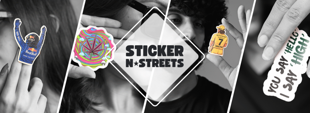
Finding The Soul of Sticker N Streets

Once we understood what SNS stood for, the brand started revealing itself naturally. It felt digital-first. Culture-driven. Built around expression rather than decoration.
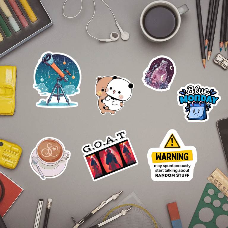
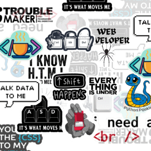
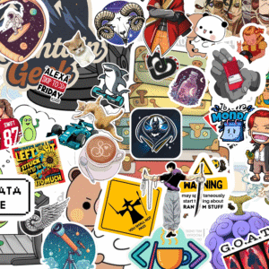
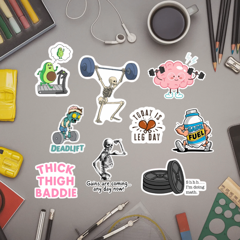
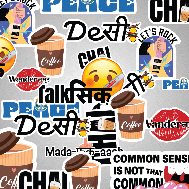
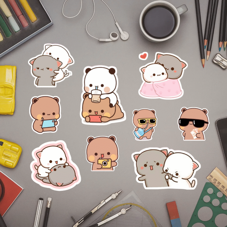
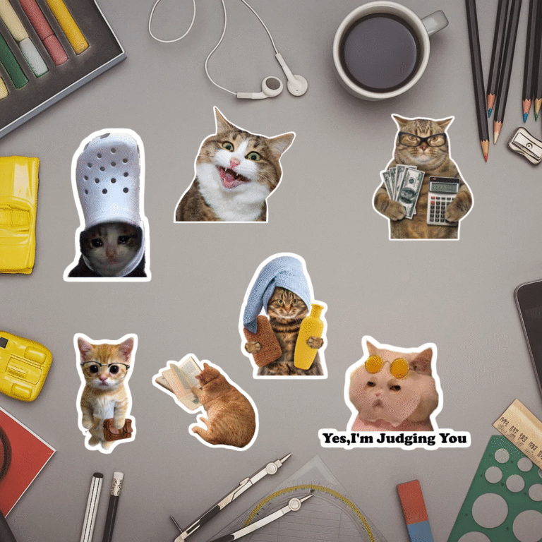
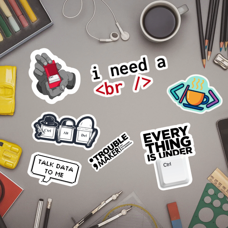
This phase wasn’t loud or visual-heavy yet. It was messy in a good way. Mood dumps, reference boards, category explorations across pop culture, motor-inspired designs, street phrases, and emotion-led sets. We observed how people actually behave on Instagram and D2C platforms, not how brands think they behave.
Only when things felt clear in our heads did we move to creating visuals.

Exploring Worlds Before Locking a Logo

Instead of rushing into a logo, we explored worlds.
Stylescapes helped us test different visual directions without committing too early. Some were loud and playful. Some were cleaner and more minimal. Some leaned into street grunge, others into crisp vectors and typography-led systems.
Every direction sparked conversations. Internal debates. Client reviews. Refinements. Re-thinks.
The question was never, “Do we like this?”
It was always, “Does this feel like Sticker N Streets?”
When the answer finally became a confident yes, we knew we were ready to move forward.